TL;DR
Industrial logos should feel strong and sturdy without leaning on cranes and hard hats.
A monogram of the brand initials can carry the whole idea when the shapes mean something.
Concept one failed on legibility, so I simplified it into a letter mark inside a shape.
Colour is easy to change, so I lock the concept first and refine colour after.
I keep textures out of a logo by default, but explored brushed metal when the client asked.
A good industrial logo feels strong and sturdy without showing a crane or a hard hat. The trick is to find simple shapes that suggest steel and structure, then build the brand around them.
Industrial clients are a great niche, but their category is full of dated, literal logos. You want something that looks professional next to the big players and still feels like it belongs on a job site.
Here is how I designed the logo for Platinum Fittings. They are an Australian company that does steel rigging and erection for large infrastructure projects.
Start with the brief and the feeling
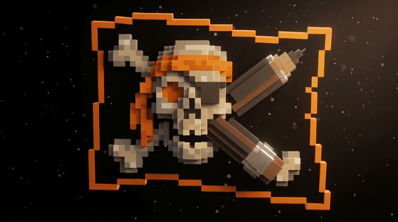
The client brought an AI image of the style they wanted. I used it as the main inspiration for the first round of ideas. It was a useful way to see their taste before I drew anything.
From there we set the feeling the logo had to carry:
Sturdy and strong.
Masculine and solid.
Clearly about steel, construction and building.
Not a cliche.
To make it unique, we chose a monogram of the two initials, P and F. Letters are ownable in a way a generic beam icon never is.
Explore concepts and kill the weak ones
The first round had several directions. One used steel beams. One was more abstract. One angled the letters.
None of them felt right yet. They did not look professional enough, even though the fonts were working.
Concept one had an angled mark with a condensed industrial font. I tried putting the letters inside a square, but I did not like it. I did like using angles and shapes to suggest steel beams, because this client lifts beams with massive cranes every day.
That led to a sliced monogram. It looked cool, but it had problems:
The P and the F were hard to read.
The spacing was uneven.
The letters did not sit well with the font.
If a monogram is hard to read, it is not finished, no matter how cool it looks.
Simplify into one clear idea
Concept two was simpler. It put a PF logo inside a shape. I cut the edges at an angle so they look sharp and cut, like fabricated steel.
I paired it with Clash Grotesk. The mark and the font felt solid together straight away.
The idea behind it is easy to explain to a client:
The letters are the steel beams.
The box is a structure, a building or a warehouse.
The steel sits inside it because steel is the framing.
I did test the letters on their own with no box. They did not work as well, so the box stayed.
Present the logo like a brand
I never send a logo on a white page. The presentation showed the concept as a whole brand so the client could picture it in use.
The mark with a badge version.
The concept story of steel beams inside a structure.
The mark as a repeat pattern.
The fonts and supporting icons.
Mockups of the logo in real settings.
A side by side with competitors.
The competitor comparison did a lot of work. Most of the other logos looked very outdated. One was very literal, with a crane sticking out of it. Next to them, the new mark stood out.
Refine colour after the concept is locked
I work in rounds. Once we had a concept that looked clean and worked, we moved on to colour.
The client was not feeling the first colours. He wanted more of a titanium feel, not just a flat grey. So I made a set of options:
A version with a blue tint.
A version with more grey.
A version with an outline to make it pop.
Each one checked on white as well.
I do this whenever we are not 100% sure on colour. Colour is always easy to change, so I lock the shape first. The client loved the titanium direction.
Handle the texture request carefully
Then the client asked, what if we added a texture? As a logo designer, I try to keep it simple. I usually avoid textures and effects in a logo.
I still explored it, because the request made sense for a steel company. In real life there are different types of metal finishes, like brushed effects or cutouts. I tried a few brushed metal looks inside the mark.
He picked one he liked. I felt the lighting was a little off, but it looked really good on the P. A textured version like this works best as a special version, with the flat mark kept for everyday use.
Carry the logo into the website
The brand then went straight into the website. I built it in Framer, which is my main tool.
I started from a template to move fast.
I added the client's images, videos and logos.
I customised everything to fit their portfolio.
I added clean animations, hover effects and 3D icons.
The colour palette ended up black and orange. The logo sits in the top corner, with the white version at the bottom of the page. The client said he was very impressed.
Do you run an industrial or trade business and want a brand built this way? You can see how I work at Mura Studio.
The bottom line
An industrial logo works when simple shapes carry the feeling of steel and structure. Lock a clear, readable concept first. Then refine colour and texture in rounds with the client.
Questions, answered
How do you design a logo for a construction company without being cliche?
Start with the feeling the brand needs, like sturdy and strong, then find shapes that suggest it. For my steel rigging client I used angled cuts and a box that reads as a building frame. That avoided the literal crane that many competitors use.
What fonts work for an industrial logo?
Bold, condensed or geometric sans serif fonts feel solid and engineered. In this project I tested a condensed industrial style font in the first concept. The final concept used Clash Grotesk.
Should a logo have a texture like brushed metal?
Usually no. I keep logos flat and simple so they work everywhere. If a client wants texture, explore it as a version for certain uses, and keep a clean flat version as the main logo.
How many logo concepts should I show an industrial client?
Show a small number of strong concepts in a proper presentation. I showed each idea with its fonts, icons, a pattern, mockups and a comparison against competitors. Then I refined the chosen concept in rounds.
Is it OK to use a client's AI image as logo inspiration?
Yes, as a starting point for style. My client brought an AI image of the look they wanted. I used it to guide the first ideas, then designed the actual mark from scratch.

Written by Jeremy Mura
Brand designer, founder of Mura Studio and Designer School