TL;DR
If a client says your logo looks cheap, the problem is rarely the idea.
Cut the logo to one core idea you can describe in a single sentence.
Never use a font as is. Adjust the kerning and weight, then customise one letter.
Keep to three main colours or fewer, and check the icon at 16 or 32 pixels.
Present the logo as a full brand system on real mockups, never on a white artboard.
If your client says your logo looks cheap, it is probably not the idea. It is almost always one of six things, and every one of them can be fixed.
I have designed brand identities and logos for real clients for the past 10 years. The same mistakes come up again and again. They make good concepts look like a quick job.
Here are the six things that make a logo look cheap, and what to do about each one.
Cut the logo to one idea
A cheap logo tries to say everything. It packs in every concept and every thought the designer had.
You end up with a leaf, a house, a tick and an animal in one mark. Maybe a building too. It clutters the logo and nobody can read it.
Premium logos work differently. They have one core idea. Then they add maybe two or three elements pulled from the brand keywords or the strategy.
Test it: can you describe the logo in one sentence?
If you need to over explain it, and the explanation takes too long, something has to go. Cut until the one sentence works.
Stop using the font as is
Default fonts can be good. There are a lot of great type designers out there making great fonts.
But the fastest way to look cheap is to type the name in a font and leave it there. Here is how I fix it.
Adjust the kerning. Kerning is the space between the letters. Fixing it will often solve the problem on its own.
Adjust the weight. Don't go really thin or extra bold. Find the balance in between. I usually go for medium, semi bold or even regular.
Customise one letter. This is the step that makes it feel premium.
For that last step, ask yourself a few questions:
Can I add a ligature, where two letters connect?
Can I make a cut somewhere in a letter?
Can I put the silhouette of a shape inside one of the letters?
Can I customise the ascenders or the descenders?
These are small changes. Together they make the wordmark feel made for the brand, not picked from a menu.
Use fewer colours
Mix too many colours and the logo looks washed out, muddy and just weird. So don't use the default swatches in Illustrator or Figma.
Build your own custom palette instead. You can always look online at what colours other people are using for ideas.
This is how I set up a palette:
One main colour, usually a vibrant one. I use it for all the calls to action.
Accent colours, plus greys, blacks and whites.
Extra colours added later, only to complement the vibrant main colour.
Don't make everything saturated. Keep a balance so you get contrast.
Look at premium brands and you will see three or fewer main colours. Everything else is there to support them.
Fix the spacing and balance
A lot of logos have a massive gap between the icon and the wordmark. That gap causes problems with legibility. It also makes the logo harder to scan.
The weight of the icon against the type matters too. Watch for these mismatches:
Icon | Type | Result |
|---|---|---|
Light | Really bold | Looks weird |
Rounded edges | Sharp edges | Looks weird |
Matching weight and edges | Matching weight and edges | Reads as one logo |
Sometimes the letters themselves don't look even. A free font may not have been kerned properly.
This is where you use optical alignment instead of mathematical alignment. You use your eye to level things out, not the numbers.
If a logo feels slightly off and you don't know why, this is usually the reason.
Make it work small
Your logo will often be tiny. Think of a favicon in a browser tab, or an app icon on a phone next to other apps.
That is why I like combination marks, with an icon and text. I use the icon for those small spaces.
If the icon doesn't work at small sizes, it turns into mush. That goes for print too, like a business card.
Here is the check I run:
Design it small first.
Shrink it to about 16 or 32 pixels and look at it.
Cut out the extra details.
Make a simplified version just for small sizes.
Check it big as well, to make sure it still works.
Show it as a system
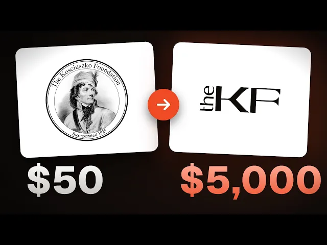
This is where the price really gets set. Show a logo on a plain white artboard and it will look like a $50 logo.
You don't want your client to feel that. You want them to be wowed by the first slide of the presentation, or the first mockup.
So make the logo, type, colours and icon feel like one piece. One brand, one system, all working together.
I always show mockups on real applications that fit the business:
A merch brand goes on hats, T shirts and hoodies.
An AI brand goes on app icons.
Most brands also get social media designs, banners and digital posters.
You are not selling the logo. You are selling how the business will look everywhere. Paint that picture for the client.
If you want to learn how I design brands and websites, including my AI workflows, that is what I teach in Designer School.
The bottom line
A cheap looking logo is rarely a bad idea. It is clutter, an untouched font, too many colours, poor spacing, an icon that fails small, or a lonely presentation. Fix those six things and your work will look premium.
Questions, answered
Why does my logo look cheap?
It is usually not the idea. Most cheap looking logos have too many ideas, an unedited font, too many colours, uneven spacing, an icon that fails at small sizes, or a plain presentation. Each of these can be fixed.
How many colours should a logo have?
Premium brands tend to use three or fewer main colours. Start with one vibrant main colour, then add greys, blacks and whites. Add supporting colours only to complement the main one.
How do I make a font look custom in a logo?
Adjust the kerning first, then pick a balanced weight like medium or semi bold. Then customise one letter. Add a ligature, make a cut, put a shape inside a letter, or change an ascender or descender.
What size should I test my logo at?
Shrink the icon to about 16 or 32 pixels. That is close to how it appears as a favicon or app icon. Remove details that turn to mush, make a simplified small version, then check the full size version too.
How should I present a logo to a client?
Never on a plain white artboard. Show the logo, type, colours and icon together as one system. Put it on mockups that fit the business, like merch for a clothing brand or app icons for an AI brand.

Written by Jeremy Mura
Brand designer, founder of Mura Studio and Designer School